I wanted a new transparent and custom-made case for my new phone. Here’s how it went.
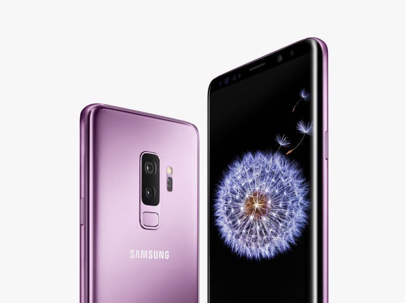
In March, I got the brand-new Samsung Galaxy S9, in lilac.
I remember towards the end of February, my Samsung Galaxy S4 has…. suffered damage. Its life was hanging on a thread. Honestly, I can’t testify on how it kept going at that point. So I rationalized to myself the fact that I was due for a new phone.
Having enjoyed the Samsung that has accompanied me in recent years, I decided to stay faithful and browse models of the same brand. That’s when I saw it, violet, brand-new, with its ability to take videos at 960 f/s and create Super Slowmo videos…
True love.
I needed the Samsung Galaxy S9 in purple, absolutely. The hyperconsuming culture has conditioned me to this point: it is purple and it shines? Must have.
Also good: is it golden and it shines? Is it pink and it shines?
Plus, this is the first phone I bought by myself. My last was dated from the summer of 2014. I had been wise; I had been waiting for its warranty to expire before manipulating it and installing new ROMs on it.
I really deserved a brand-new phone.
Anyhow, everyone knows that with a new phone comes a new case.
It’s the bare minimum you gotta do to protect it and not break it during the first week because, God knows, it slips easily off your hands. There’s probably a patent on the technology behind the new smartphone cases, designed to optimize the aerodynamics of the phone and reduce the friction of the case in your hands, in order to create a trauma in the collective conscious in the consumers’ minds and sell more guarantees for screens.
It’s obvious.
Going back to the case, however, I had a new problem. The choice of a purple model brings a unique challenge to beautiful devices: the case must not hide too much its color. If I didn’t buy it black, it’s because I want the rest of the world to see the purple.
Otherwise what’s the point?
So I need a case with transparency. These however are not known to be very protective. I’m not buying just any case, and take the risk of damaging my new phone.
Moreover… my artistic ego would like to be able to make myself the design that will be displayed. To make it extra unique, be superb and enviable, or just terrible. Whatever, I want my drawing on it.
So these are what I needed for the new case:
- Must be adjusted for a Samsung Galaxy S9, the latest model not yet released
- Must be transparent
- Must be able to put my design on it
On that, I started my research.
Print-on-demand services
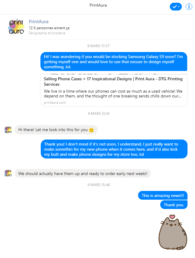
I follow closely print-on-demand services such as Printful (affiliate link), Print Aura and Gooten, just to name those I like.
Two weeks before the phone came out, none of the three offered case models for the Samsung S9 or its templates. Which was a little disappointing, because at the announcement of the iPhone X, Gooten had sent me an email that they already had the templates, two weeks before its release.
So I decided to contact the suppliers. I first went to Print Aura, because they already have nice folio type cases, and if I wasn’t to have a transparent case, I’d go for that, because it’s chic, whatever. I can still live if people don’t see lilac (although, the first week I received my temporary case and my phone, a waitress noticed and recognized the purple through the hole for the camera. I felt rich and famous.)
It’s just a little later that my brain did:
“Oh crap, I need a transparent case.”
I’m a slow one, okay?
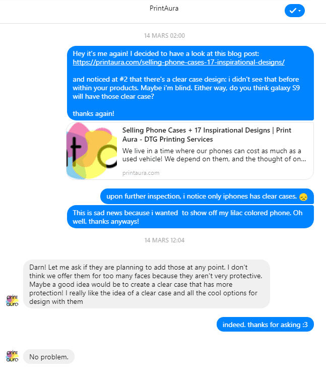
Obviously, Print Aura and I were on the same wavelength: the transparent cases are cool, but usually sucks.
Then, in April, Printful announced its transparent models printed with UV technology for Samsung S8/s8 + and S9/S9 +.
However, Print Aura made me a follow-up before in March, and I was instantly sold. Let’s say they promised me a lot better than a simple transparent case:
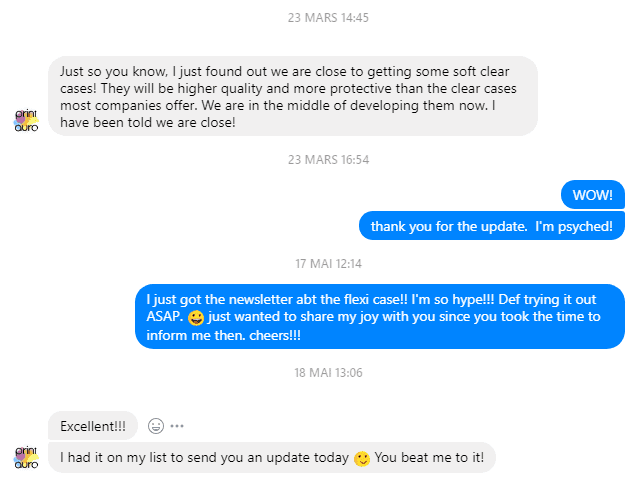
So, as soon as the Flexi Case was announced in May, I started sketching the ideas of what I would like on my new phone.
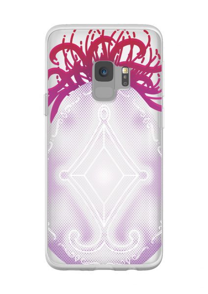
Design for the lilac Samsung Galaxy S9
My phone is lilac: I must admit that it is not my favorite color, all the less a color with which I am accustomed to work. But I knew exactly what I wanted on it: the emo representation of my existence, a reference to Akemi Homura.
Yes, an anime reference, very original, but it’s my phone and I’m a child, I do what I want. :^)
My idea of the custom design

The important features of my design: the Soul Gem of Homura + the spider lilies (see on the left).
Obviously, I want to see clearly the purple under the design, so the basic idea was to make white outline design, keep it simple, but I am a person of colors, so I could not resist the urge to try to make the flower in red and give it an edgier style.
We can see the sketches I did for it on Twitter (as well as an entire tweetstorm about the design process) here:
https://twitter.com/mechamyu/status/1002044261527941121
In my sketches, we can also see that I am the type to draw in 148712 details for nothing… I can not help it, I love details, so I just have to make it work.
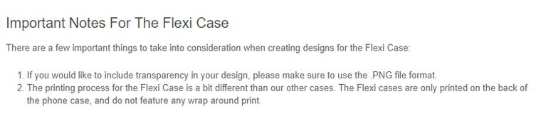
Obviously, there are design constraints on transparent cases. As explained on Printful’s website, I was allowed to:
- Print 100% opaque color with holes to see the color underneath, and/or
- Translucid colors (99% opacity and less).
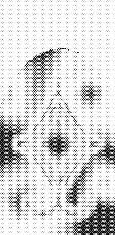
I really thought that to make a design with halftone was the only solution for me because I was not familiar with the UV printing technique. It gave me several ideas.
However, since I wasn’t printing my case at Printful and that the interface of Print Aura is meh and it is not really clear if they put a white underbase on everything or if the translucid effect was also available, I decided to opt for a design completely opaque, using halftone and opaque gradients in the hope of making an interesting effect.
Making of
On this, I started to draw (finally). All in all, I made it in about 3 weeks, with a little time invested here and there.
I started editing on Illustrator, but in the meantime, I dumped almost everything Adobe for free or low-cost software (except Photoshop, I’m an addict), so I finished the design with Affinity Designer, during my 7-day trial. I then bought it, because it works very well (Inkscape is good too, but I feel claustrophobic when I use it.)
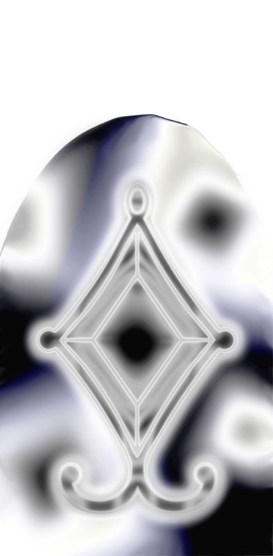
In short: the design that I chose to realize has the gem of Homura in the center, an egg shape around, and the flower going outwards. I used a few design items I bought recently, especially for the egg line and to draw the lilies.
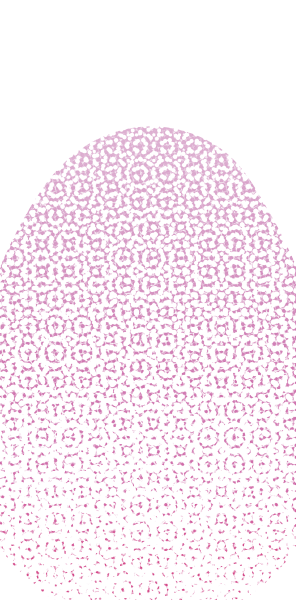
Inside the egg, I wanted a gradient effect, much like bubbles or “cluster” and with the white print underneath, the only way is really with halftone. So I made a first attempt:
https://twitter.com/mechamyu/status/1002433511834443781
Honestly, I have Photoshop, but it always annoys me to make halftone. I was delaying it until the day I would have enough courage, but, miraculously, the next day I get an ad for this product (affiliate link): HalftonePro Vector Pattern Toolkit.
So I created a black and white image of the gradient effect I wanted and I passed it in the tool. I used the four-pointed stars because they were reminiscent to the symbol of Homura, but for a nicer result, I chose to have bigger “points,” so there was less detail in the dotting.
 =>
=> 
I was very satisfied with the result, though, in the end, I duplicated the texture and I mirrored it because I found that the black spot at the bottom-right was too intense and unbalanced the whole thing. All in all, however, the result was great.
I integrated it into the egg, I applied a gradient of pale violet on the edges, up to the white in the center, in the hope that the color change would more or less fit into the metallic color of my phone. I’m crossing my fingers!
Final Product
Ta-daaaa:
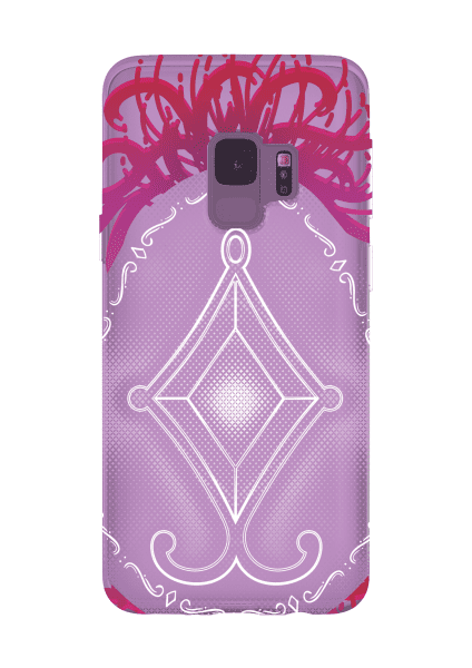
OK, it’s not perfect, but it’s the first product I actually show publicly, so, we wait for the real life pictures before criticizing the mock-up… which is not even well done… I just did it quickly without Photoshop… because it takes a thousand years to launch… then there was no mock-up for the Samsung S9 in purple available, so I had to do something a little sketch to try to represent the color…
Anyhow, that’s the idea.
I sent my order on June 20, 2018, and right now we are on July 2 and it still hasn’t been started by the Print Aura team, which irritates me a bit, so, earlier today I went to make a complaint in their ticket system. Otherwise, I still hope for a, at least, satisfying level of protection.
If it’s ugly, well, I’ll try again. There are a few things I probably should have done differently:
- I would have liked not to include the features of the gem in opaque white like that. I would have preferred it to be more subtle and fit into the semitones. But the result I made with Halftone Pro was prettier with less detail. If I have to do it again, I will spend more time on it;
- The Spider Lily is pretty, but, without white underbase, it would have been perfect in solid red, without gradient to purple, with only a gradient in opacity;
- The egg that protrudes on the sides has a strong chance of being ugly when going out if Print Aura doesn’t print to the sides. If there’s a margin, like at Printful, it’s going to be ugly.
On that, I pray that it is still nice. It wasn’t too expensive, at least!
Pictures of the result as soon as I get it 😊
References & extra
- My tweetstorm: https://twitter.com/mechamyu/status/1002044261527941121
Print-On-Demand stuff
- https://printaura.com/common-mistakes-understanding-underbase/
- https://www.printful.com/transparency-in-dtg-files
- http://www.raydombroski.com/blog/2016/5/13/how-to-prepare-designs-with-transparency-for-dtg-t-shirt-printing
- https://blog.redbubble.com/2017/03/using-halftones-to-create-transparency-in-shirt-designs/
- https://creativepro.com/how-to-make-amazing-halftone-effects-with-photoshop/
- https://www.friendlyarcticprinting.com/print-styles-techniques/
- https://www.printful.com/custom/phone-cases/samsung-galaxy/samsung-case#guidelines
Edit juillet 8 2018: I had answers from the Aura Print team, and they lost my case, lol. I have been refunded in credits in their system, but I will wait to see if it was sent before recommending it. The new test will be in late July.
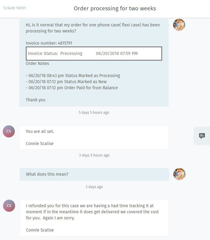
Edit 10 juillet 2018: Well, apparently, I made a mistake! At least I’m learning 🙃
The issue is that… I don’t know what the mistake is.
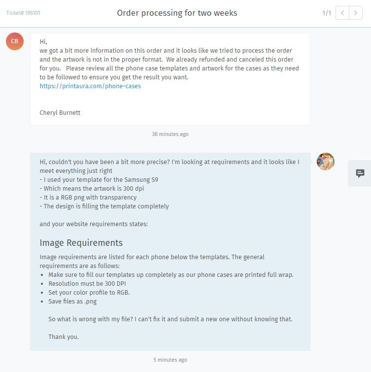
I will not lie, I replied with a lot of attitude. Moreover, I suspect that the problem is not even in the “Image requirements” but rather in another section of the page, a little further:
Ah, shit.
Not only will my beautiful design not go on the sides and my dreams are destroyed, but my file goes beyond the lines to give slack (in the optics that it goes to the sides).
And my design is not something kind of simple as a photo or pattern that repeats itself. It’s full of details. So it surprises me that they didn’t know what to do and decided that it was outside of the “Image requirements” rather than trying to fit my design into their template.
However, they could still have told me. Their template file is identical to other phone models. It is not written anywhere: “Please do not exceed lines.”
Mrgrgr.
Update a bit later:
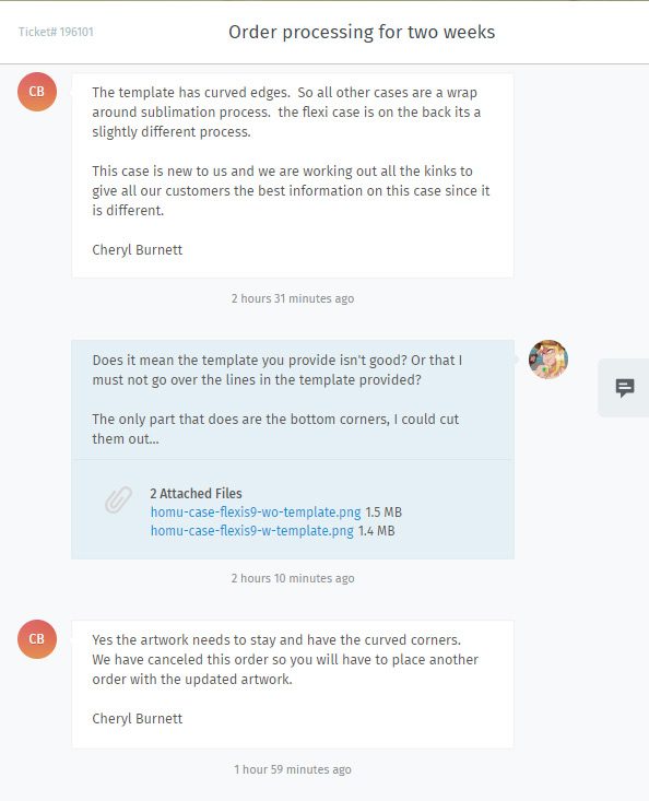
Ding ding ding: it must not exceeds the lines! So I remove the flowers under the egg below as it won’t wrap. Meh, it’s going to be okay anyway.
New mock-up (trying not to make it purple this time):
And I also notice that there is a shipping date to my old order… dated June 27th. I didn’t get an email about that.
Anyway.
If I receive two phone cases I think I’m crying, lol. At least I would be able to see the differences in quality between the two (subtly different) designs!