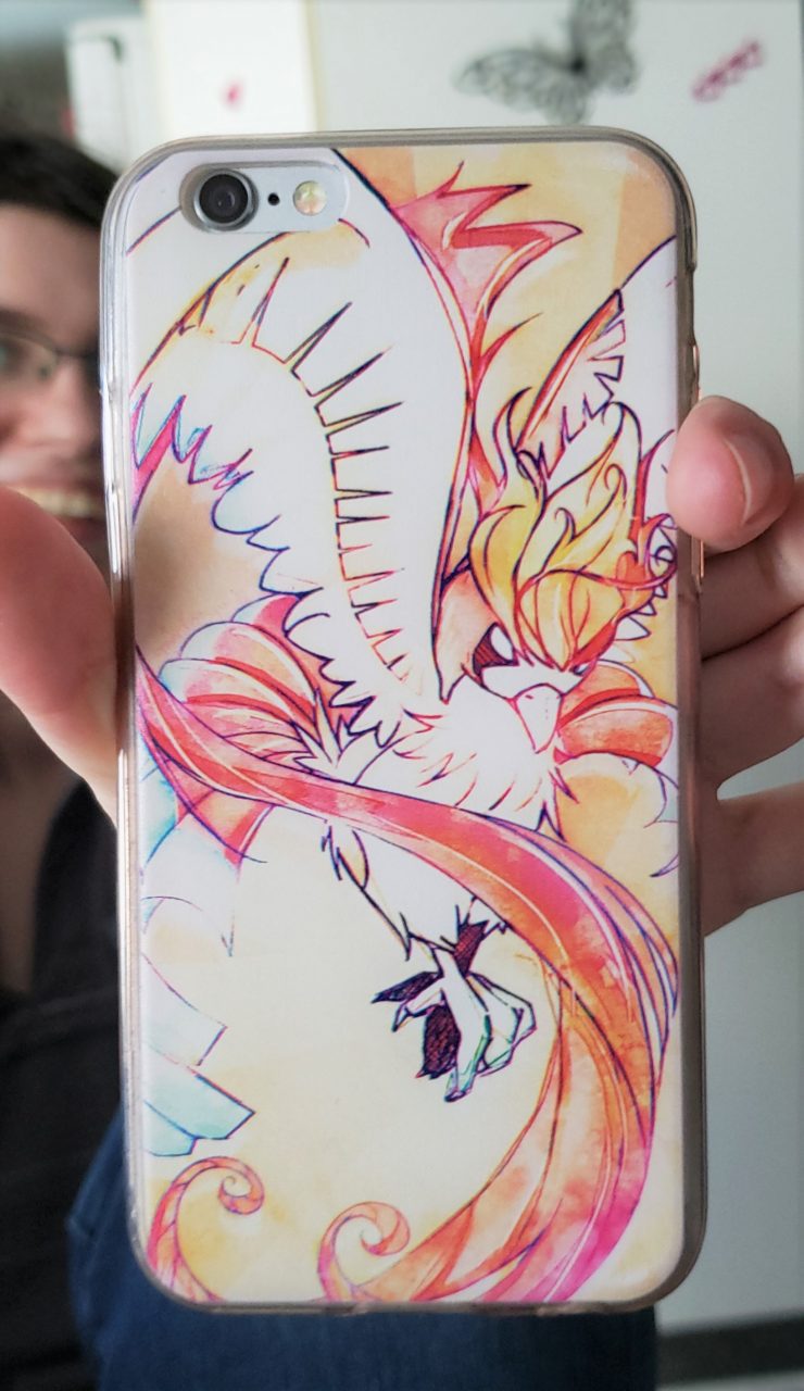
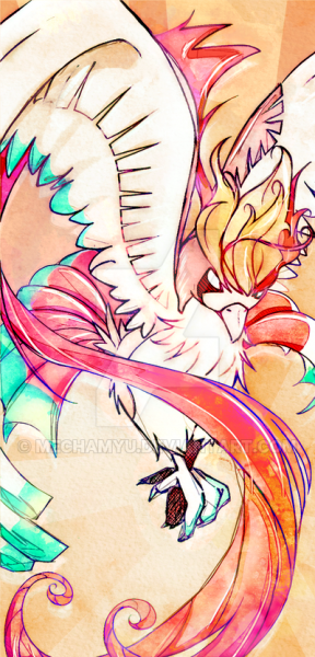
Made this as a gift for my brother, Lou, and printed it on a phone case.

On print, it turned out OK:
- I had to remove the green and replace it by a tame cyan,
- the oranges in the background didn’t distinguish themselves very well as much as they did on the screen, so it’s just one blob instead of the sun
- overall it looked lighter and less saturated than on my screen
Still, this is fine enough. At least, now I have something to compare to when it comes to printing very saturated reds and oranges (and a little cyan). And Lou really likes it, so that’s awesome!

