The tale of an overdue comeback.
By redefining, we self-actualize.
The brand “mechamyu” (lowercase intended) is experiencing a rebirth, so to speak. In ten years, mechamyu never distinguished itself by a mark or a style, per se. In fact, it was broad enough to convey anything and everything. “mechamyu” was me, and I was mechamyu. It never meant anything else than my own ego.
In 2017, wafflebox was born out of necessity, to distinguish a business venture from my personal use of mechamyu.
It can be difficult to know where to begin.
Tragically, wafflebox’s unveiling never occurred. It stayed quite literally in the box.
I had first decided to separate the art from the artist, and store it all on my wafflebox social media accounts, notably Facebook, Twitter and Instagram.
However, what I wanted from wafflebox was a brand for apparel, not an art dump space. This pressure to be real with my brand pushed me into this complex self-aware refining.
What impactful schema could I pull off to make everything work? How could I mend the bridge?
Recontextualizing the Source
Yes, it is possible to disrupt the things that can extinguish us, but not without inseparability on our side. And to do so, I needed to go back to my original name and embrace it whole.
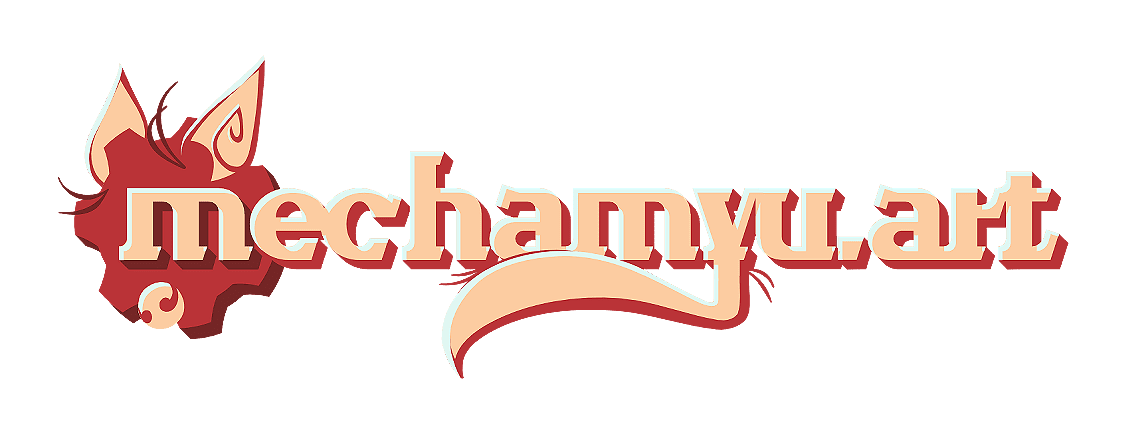
And thus, officially, the new brand name for my art will be mechamyu.art.

The future is conscious redefining
Throughout history, humans have been interacting with the universe via superpositions of possibilities. Who are we? Where on the great circuit will we be aligned? Why are we on the paths of our endeavors? Those were all questions I was trying to answer by owning my own brand instead of running away from it.
Self-actualization requires grounding, and, even though its origins are out there, mechamyu is fundamental to me. I have been using this username since 2009, after all. But why?
I tried to convey these answers through the logo’s very design. First, a straight forward, yet fancy, typeface: Wanderlust, to whom I am recently wed to, so it was only natural I would use this font to bear my mark.
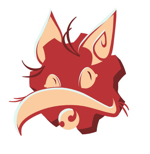
Then, let’s deconstruct the meaning: mecha is reminiscent of mechanical, robots and the likes of which. It was then represented by a cog at the beginning. But then, we have myu, which summons a picture of a cat, as it sounds like a “meow,” hence the ears and the tail appended to the letter “Y.”
Therein lies the biggest contradiction: robots are cold, calculating and inflexible figures, whereas cats are soft, adorable and basically living liquids. To live through this brand name, I had to reconcile the nature of both these elements.
I could no longer afford to do art without owning my contradicting roots
To really incarnate the whole idea, of both rough and soft, sharp yet round, as well as methodical yet charming, I created a persona with my new logo’s elements:

With it, I will be able to create expressions and reactions just like emoticons and add exactly what was missing from the brand mechamyu: life.
What’s next?
Right now, you are witnessing my brand on this website, mechamyu.art, home of my art, as you are reading this article. This website has been branded properly with the new logo and icon, and I am in the process of changing the social media accounts associated with me.
My personal twitter will stay @mechamyu, but I have converted @waffleboxed to @mechamyuart. My DeviantArt account will remain on mechamyu, and my art Instagram was rebranded to @mechamyuart. All there is left is to rebrand my Facebook page, and everything will match.
wafflebox will still exist as an apparel store, whenever I am ready to engage in designing those. If you are interested, head over there and sign-up to my newsletter to get news as soon as they come out.
With all this in mind, I say farewell to wafflebox, and welcome back to mechamyu.art.
***
Congrats on making it to the end! Did you enjoy this word vomit? It was a pain to write. Here are some tools and references I used to make this bullshit ™️ brand-update article:
- Tool: https://www.bullshitgenerator.com/
- Tool: http://sebpearce.com/bullshit/
- Reference: https://www.fifa.com/worldcup/news/fifa-world-cup-qatar-2022tm-official-emblem-revealed
- Reference: http://news.sportslogos.net/2019/10/05/introducing-the-frednats-by-george/
- And I had aid from Matt, professional logo designer and amateur sports logo critic
